Why is my satellite imagery out of date?
- Disaster Science
- Bushfire.io
- May 8, 2026
Table of Contents
If you’ve zoomed in on the Bushfire.io satellite map and noticed it looks years old (a recently built house missing, a new road not visible, a development that doesn’t appear), this page explains why, and what your options are.
What “satellite imagery” actually is
The detailed satellite map you see when you zoom in is a global mosaic of high-resolution photographs taken from space. Capturing, processing, georeferencing and distributing that imagery globally is genuinely expensive, both for the satellite operators who collect it and for the platforms that serve it to apps like ours.
Unlike the live geostationary imagery we use to track weather and fires (which we update every 10 minutes, see How-to use Satellite Imagery), the static “base map” imagery is captured once, processed, and updated only periodically. In remote regions, that may be once every several years.
Why services like Google Maps look so fresh
It’s a fair comparison. Services like Google Maps and Apple Maps appear to update constantly because their underlying imagery is heavily subsidised by enormous scale: billions of users, advertising revenue, in-house aerial photography fleets, and dedicated capture programmes that the rest of the industry simply can’t match.
We don’t have that scale, and we’re a public-benefit platform rather than an advertising business.
How Bushfire.io’s economics work
Our free tier exists to serve the public during disasters. We pay our base-map provider per user load (roughly per app session that views the map). During an active fire season we routinely have over a million people using the platform, so the base-map cost is a substantial line item.
We use Mapbox for our default satellite imagery. We’ve raised the freshness question with them several times. They’re aware, and are working on a global refresh, but the timing isn’t ours to control.
Info
For context: imagery in remote or rural Australian areas can be 5–7+ years old. Imagery in capital cities is generally fresher, but still a year or more behind reality.
What you can do
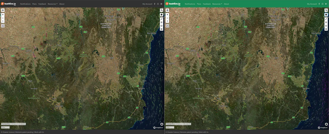
Use Bushfire.io Pro for fresher imagery
Bushfire.io Pro, Business and Enterprise subscribers get access to Satellite (ESRI), which uses ESRI’s World Imagery service. ESRI’s imagery is updated significantly more frequently than the default Mapbox mosaic, and is generally much closer to current reality, particularly in populated areas.
To switch to it on a paid plan:
- Open the right-side menu.
- Under Map Style, choose Satellite (ESRI).
Why don’t free users get ESRI imagery too?
Honestly, we’d love to offer it. The blocker is economics: ESRI’s tile pricing at the scale of a free public-benefit platform with millions of users during fire season isn’t viable for us to absorb on our own.
If you represent a government agency, foundation, or commercial partner who’d like to help fund fresher base-map imagery for everyone using Bushfire.io during disasters, we’d genuinely love to hear from you. Email [email protected] or get in touch — leads, introductions, and partnership ideas all welcome.
What we’re working on
We’re actively researching alternative imagery sources for the free tier so that everyone benefits from fresher views of their area, not only paying subscribers. This is live work, nothing to announce yet, but it’s on the roadmap.